Better School Choice
Mobile app to help parents make the right decision
Duration
October 2022 to December 2022
My Role
Sole UI/UX Designer
Overview
For this project, I was responsible for leading the launch of a new product that helps parents make the best choice when faced with a big decision about selecting a school for their children (K-12).
Outcome
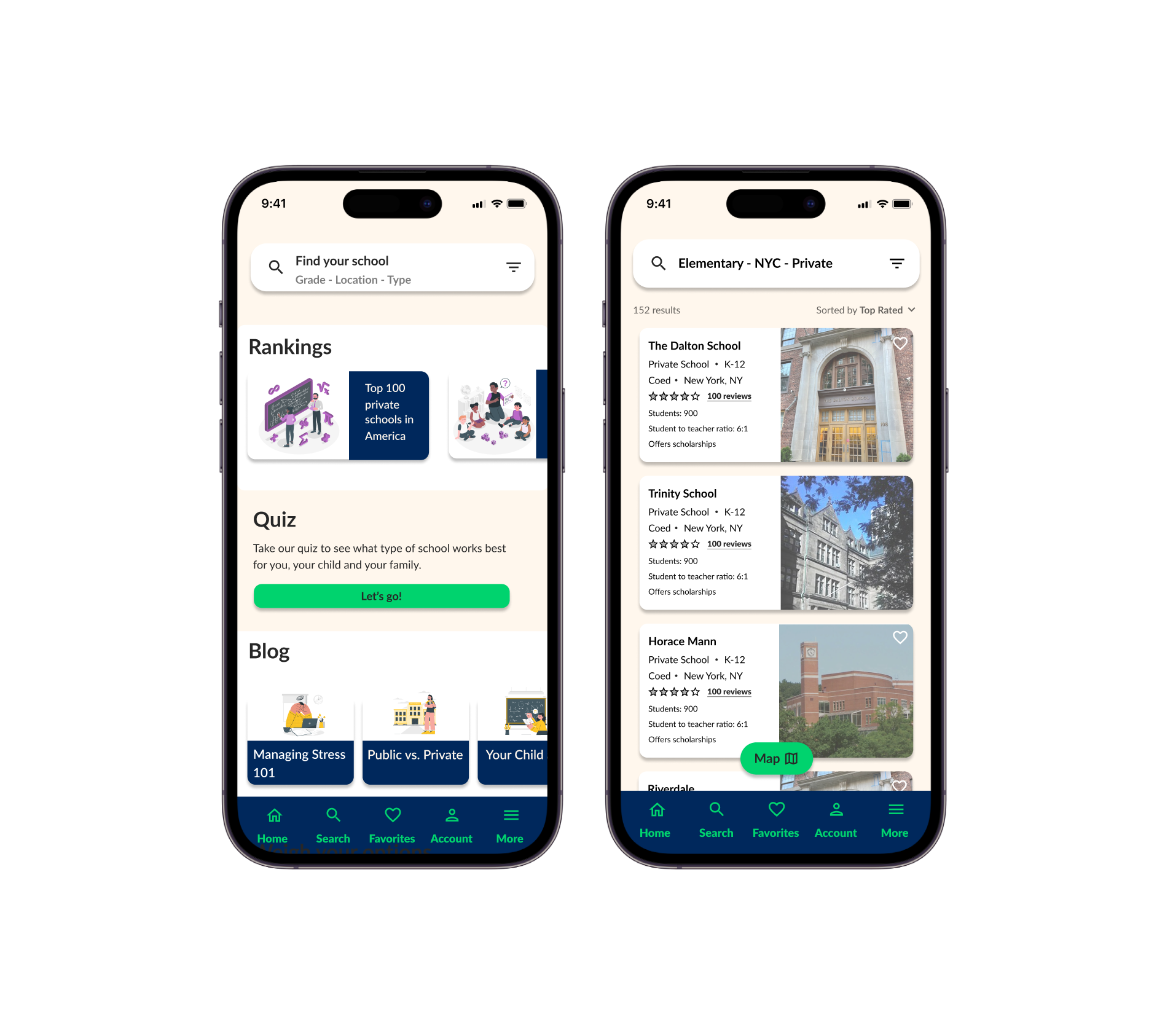
Parents had to rely on multiple platforms and resources throughout the school selection process. The Better School Choice app, however, is a comprehensive solution that integrates all the necessary tools, effectively streamlining the process and addressing the problem within this space.
Problem
The school selection process is challenging and time consuming. Parents don’t have a singular platform that helps them through every stage of the process.
Solution
The goal was to create a product that streamlines this process so parents can make informed and stress-free decisions.
Issues
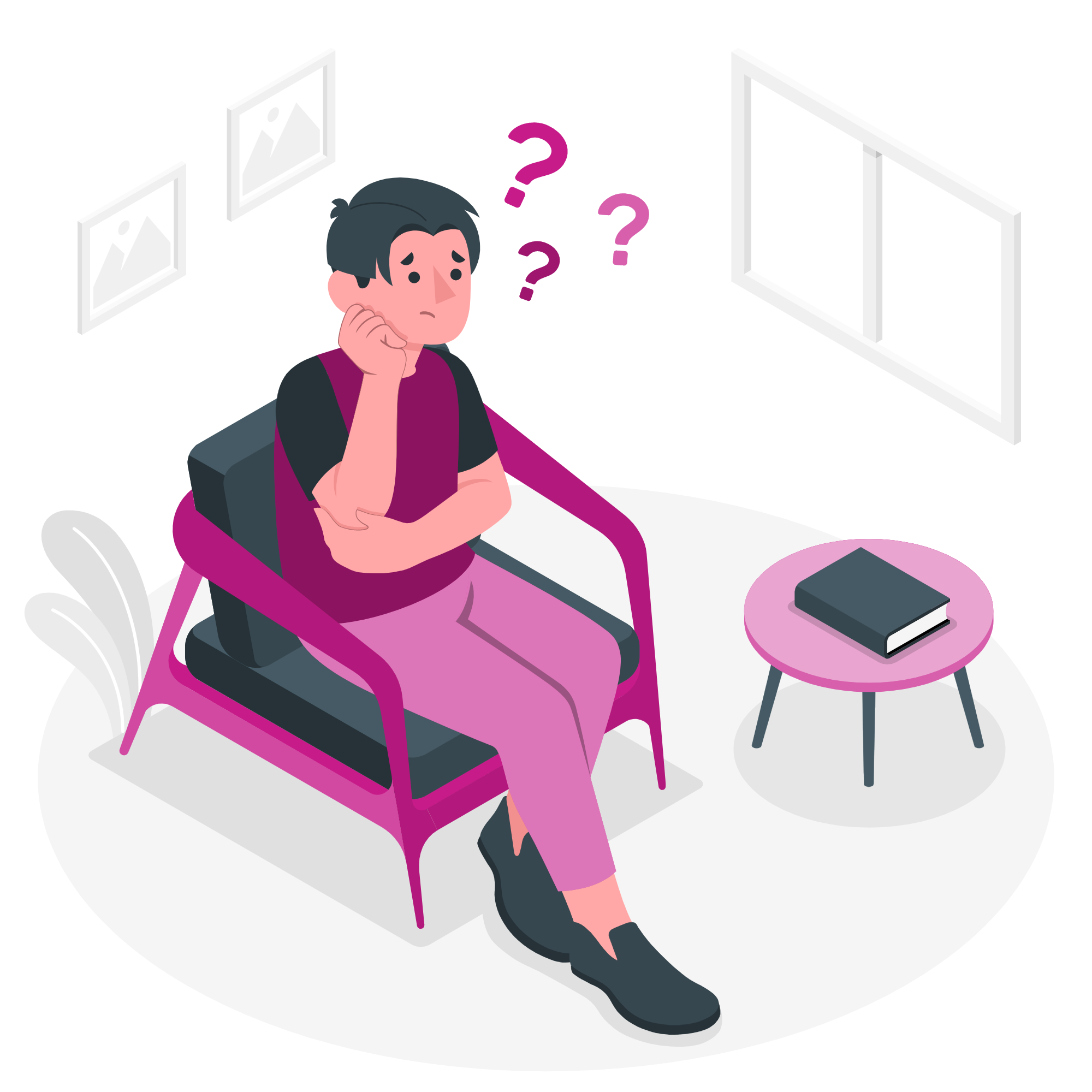
There is uncertainty that comes with making important decisions
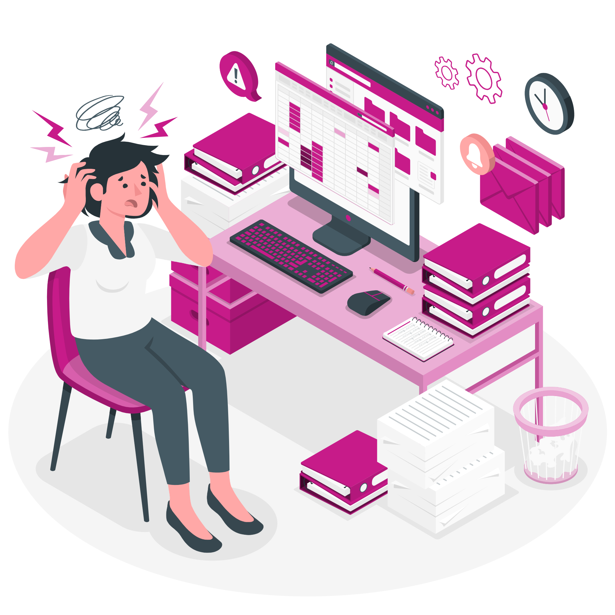
Users find themselves disorganized
Users experience information overload
It’s time consuming and stressful
Understanding the User
Target Audience: Parents of school-aged children
Transcripts: I had access to the interview transcripts with 6 mothers of school-aged children. These allowed me to determine what their challenges and needs are.
Transcript Insights
Qualitative Insights
Parents have restrictions and restraints (i.e. budget, location etc)
They have the responsibility to make a decision that will suit their child AND their family’s needs
Some parents work full-time jobs so they need a less time consuming process
Quantitative Insights
66% of families want a way to incorporate their specific criteria in a search
100% of families think the process is time consuming
Competitor Research
To learn more about the market, I conducted a SWOT analysis of 5 competitors in the market and observed some of the features they offered their users. From this, I was able to create an initial list of features I could include in my product.
Impact Effort Matrix
Before moving to the next phase, I wanted to prioritize some features using an impact effort matrix. This gave me a general idea of what my product might look like and helped me understand what features I should focus on first.
Sketches
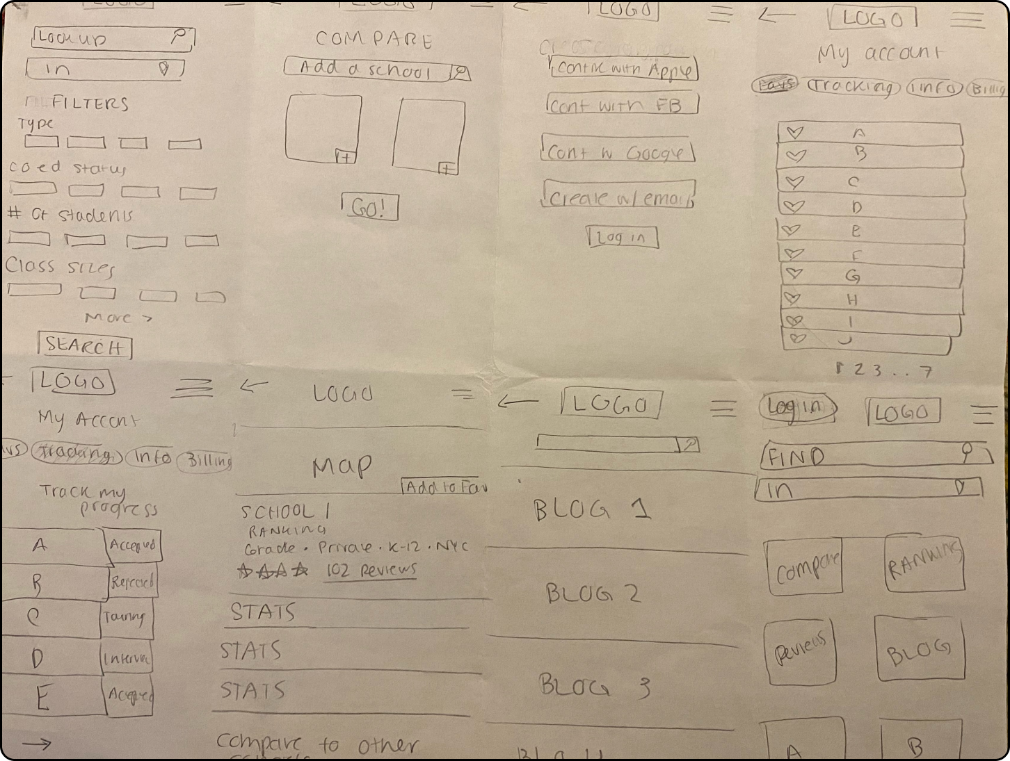
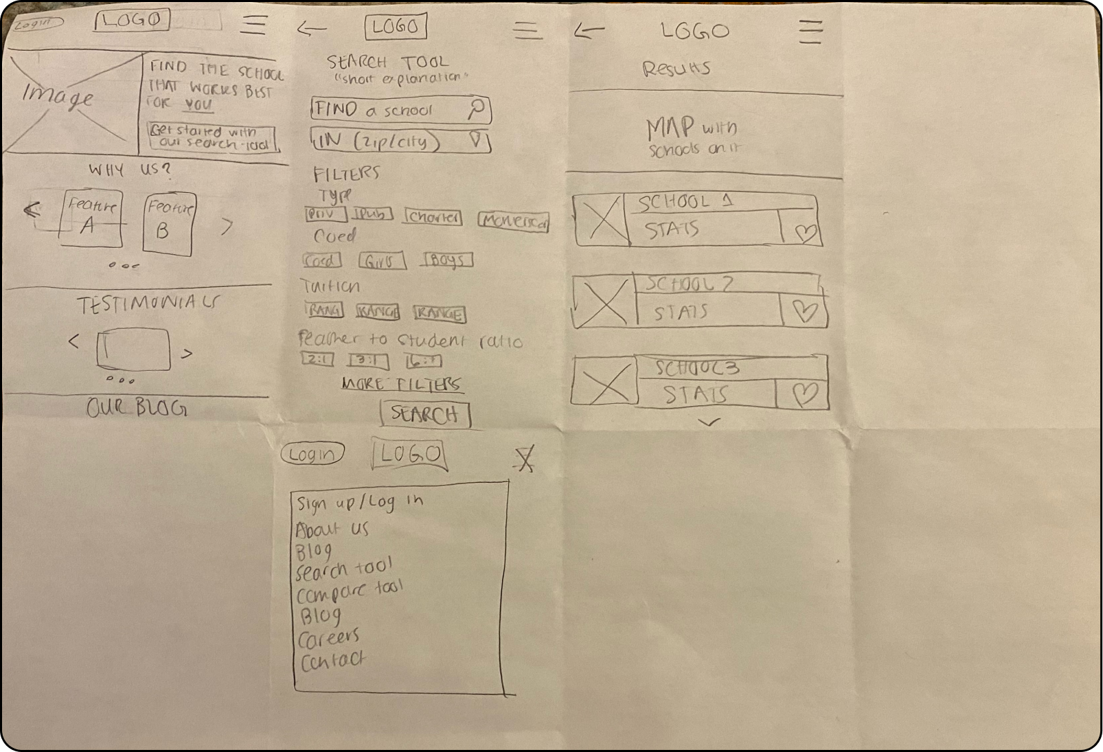
Before creating my prototype, I started off with some sketches of how I wanted the overall design to be structured. Below are a few of my sketching iterations.
Low-Fidelity Prototypes
Next, I created my low-fidelity prototype which was helpful in checking and testing the functionality of the design.
HOME
RESULTS
FILTERS
User Testing
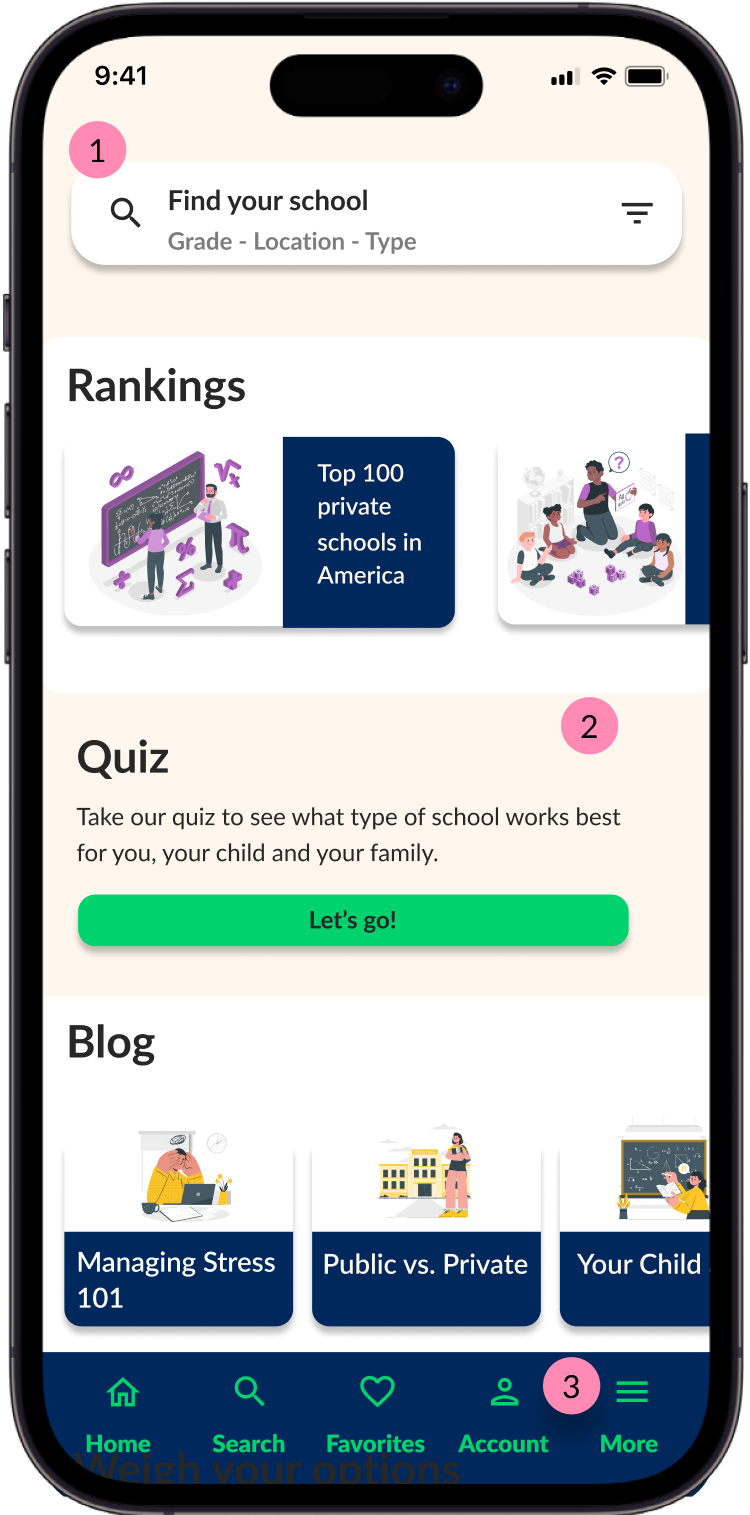
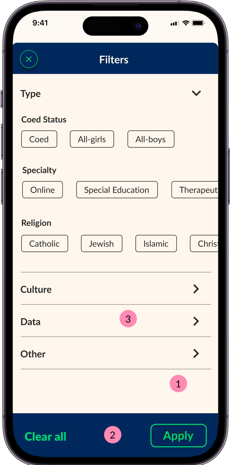
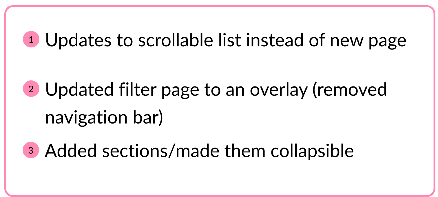
I conducted user testing of my low fidelity frames. After gathering insights from users, the following changes were made to the homepage, results page and filters page, respectively.
BEFORE TESTING
AFTER TESTING
BEFORE TESTING
AFTER TESTING
BEFORE TESTING
AFTER TESTING
Final Design (Additional Screens)
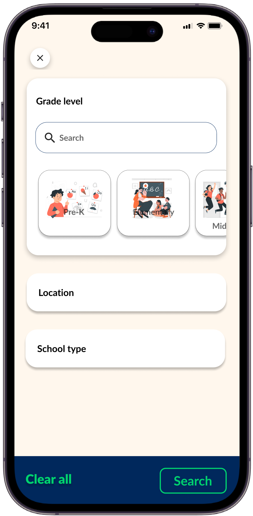
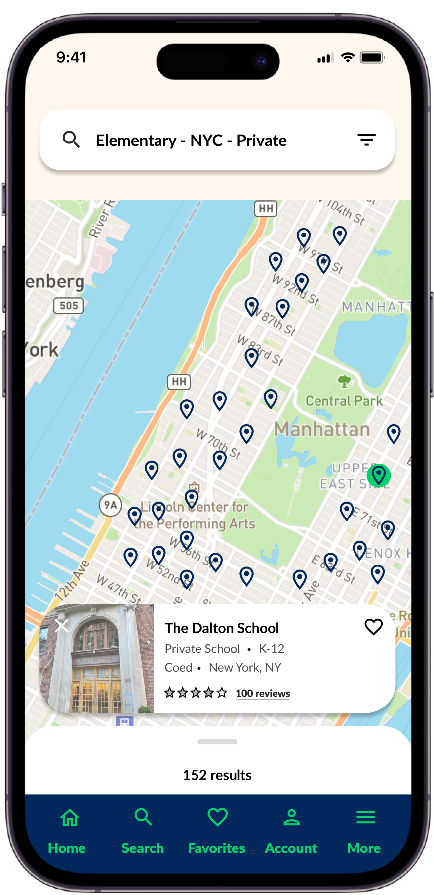
Below I will share some additional screens of my final design that were not shown above.
SEARCH INPUTS
MAP VIEW
SCHOOL PROFILE
High-Fidelity Prototype
Task scenario: find private Elementary schools in New York City, then filter that to find schools that are all-girls
Takeaways & Next Steps
During this project, I learned a lot about the school selection process and what parents prioritize during their search. In terms of design, I could have spent more time doing external research earlier on in the project. If I did so before the low-fidelity phase, I could have avoided the revision of the search bar because I would have recognized that most major players (i.e. airbnb), outside the school selection space, use one search bar with many parameters.
Another major takeaway is that there is a huge gap in this market - there is no one-stop-shop for parents during this process. Instead, they have to use multiple platforms and resources. The success in this project is that it created a cohesive products that covers every need during this process. I combined all the typical resources parents use during this process which helped solve the initial pain points in this space.
Some next steps would be to build-out the additional pages that were conceptualized in the earlier stages (i.e. compare page, profile page, tracking progress page etc.). After that is completed, another round of user interviews will be conducted.

